
Project / UI x UX / Rebrand
IT'S NEW, IT'S NOUVEAU IT'S NOOVO
IT'S NEW, IT'S NOUVEAU IT'S NOOVO

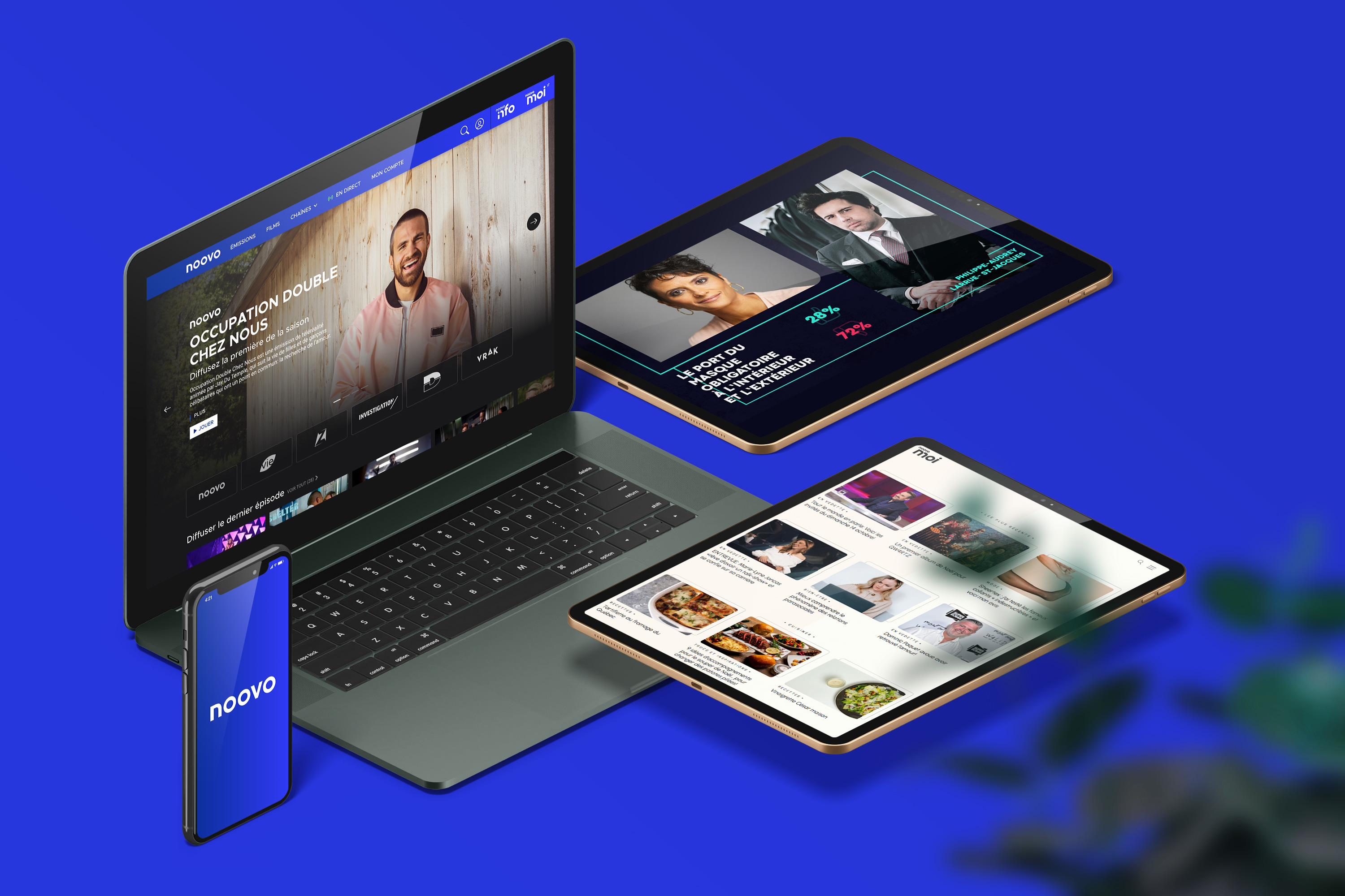
Noovo is a French-language television service originally launched in 1986 under the network Télévision Quatre-Saisons. The rebrand of noovo name played on the phonetic word of "nouveau" meaning "new" in French. With the rebrand, it hoped inject new life and capture a young audience.


OVERVIEW
UNDERSTAND. HYPOTHESIZE. INNOVATE.
Understand the variety of content offerings that Noovo has to create a connected experience between video, lifestyle, news, and much more. We postulated that Noovo needs to simplify as well as diversify in order to attract more viewership.
BRIEF
Rebrand and support noovo product in ACE on web as well as improve SEO on all other streaming and written platforms.
APPROACH
Create and test designs through agile sprints as well as make a product ready for MVP. Collect better data from launch to improve further.
OUTCOME
The redesign is much simpler in user experience without complicated and outdated user experience.
APPROACH
- As the Lead Product & UI designer, I integrated UX test and brand strategy for MVP launch.
- Participated in brand strategy planning to promote user-first strategy.
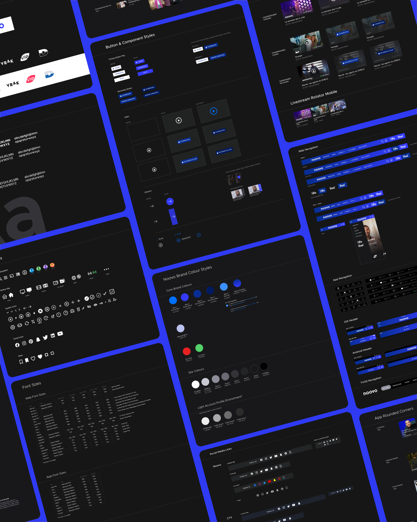
- Create scalable UI components and build design system to be adopted for larger design implementation across all platforms.
- Presented to stakeholder teams, POs, developers for cross-functional team buy-in.
- Mockup UI prototypes and worked hand-in-hand wtih development teams to build final product for implementation.
CHALLENGE
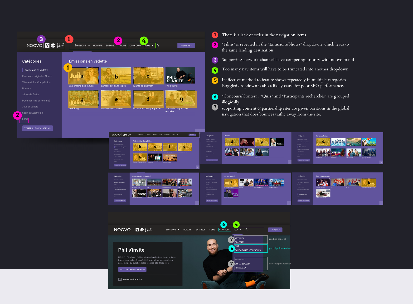
Figuring out the needs of the navigation was an important strategy in discovering noovo's business objective. In it, we noticed a myriad of activities as well as issues.
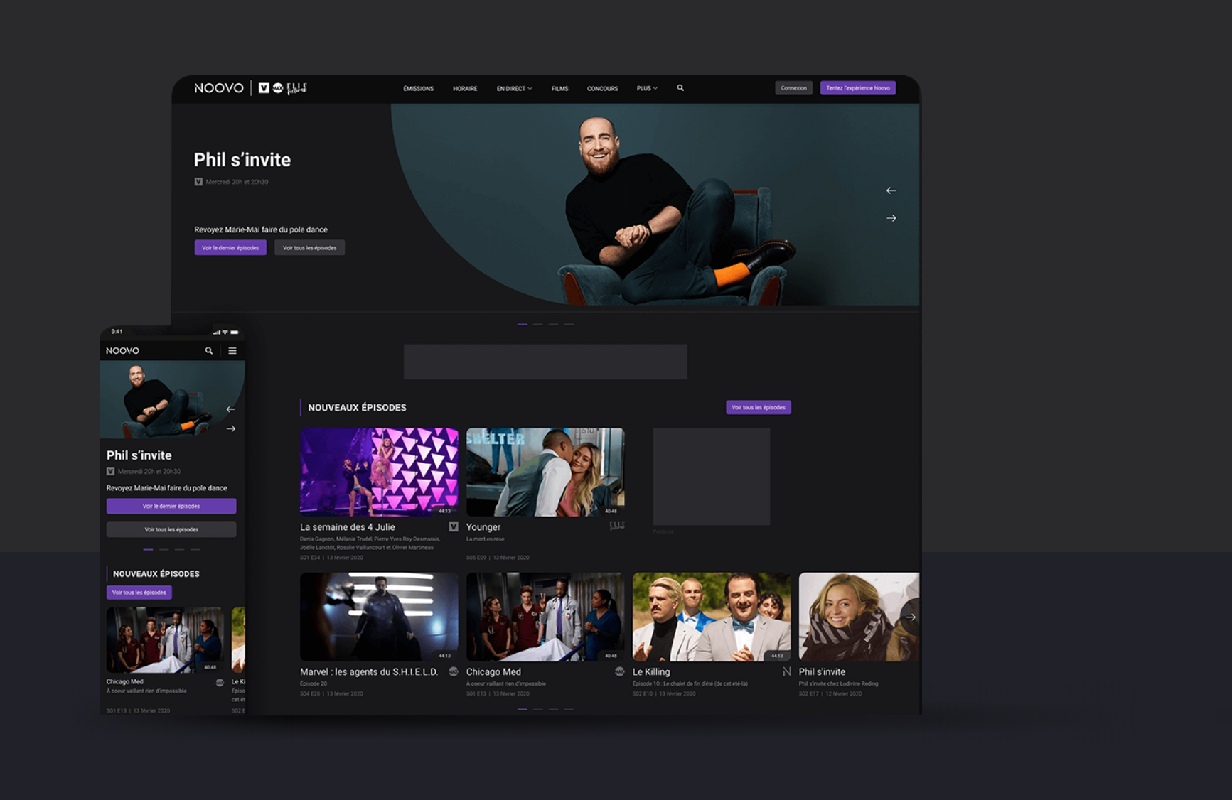
NO PLATFORM SUPPORT
Noovo was heavily focused on web. The app was not functional nor did it offer any 10ft experience.
CONFUSING PRIORITY
Noovo brand does not present a clear understanding of the types of content available on the platform.
POOR SEO
Within the web experience, users are shown a boggled navigation dropdown that is detrimental to SEO.
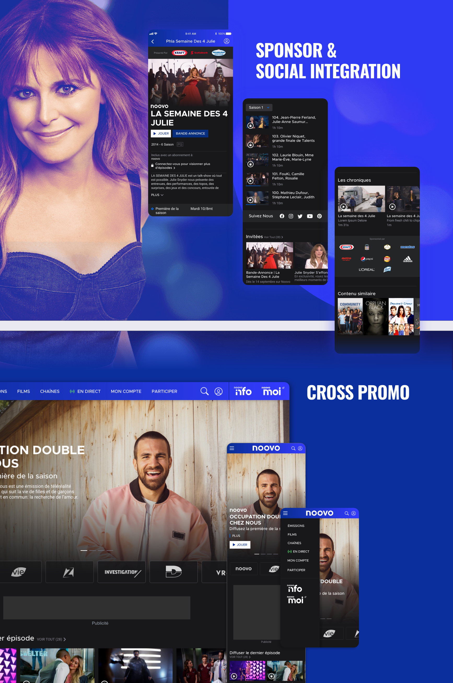
From research, issues such as repeated show suggestions in multiple categories in the "Émission/shows" dropdown gave users an impression of a lack of content. Competing priorities in promoting the channel networks negatively impacted a user's perception of the dominance of the noovo brand in its own platform. We also noticed that within the body of the homepage, there was a particular emphasis to promote supplementary entertainment content. This group of content populated in its own ecosystem and did not relate back to the show or any other component in the main navigation.
As we dug deeper, we began to notice some patterns and problems

- There were 3 types of content buckets: genres, show-specific promotions, entertainment news
- The color system seemed to be at random
- There was an association with the network brand that had no direct correlation with the content piece itself.
DIVIDE & CONQUER

Noovo
- Video Streaming
- Specialty channel
- Extras video & support content

Noov Moi
- Lifestyle articles
- Shortform videos
- Blogs
- Shopping & Sales

Noovo Info
- News content
RESTRUCTURE OF NOOVO.CA
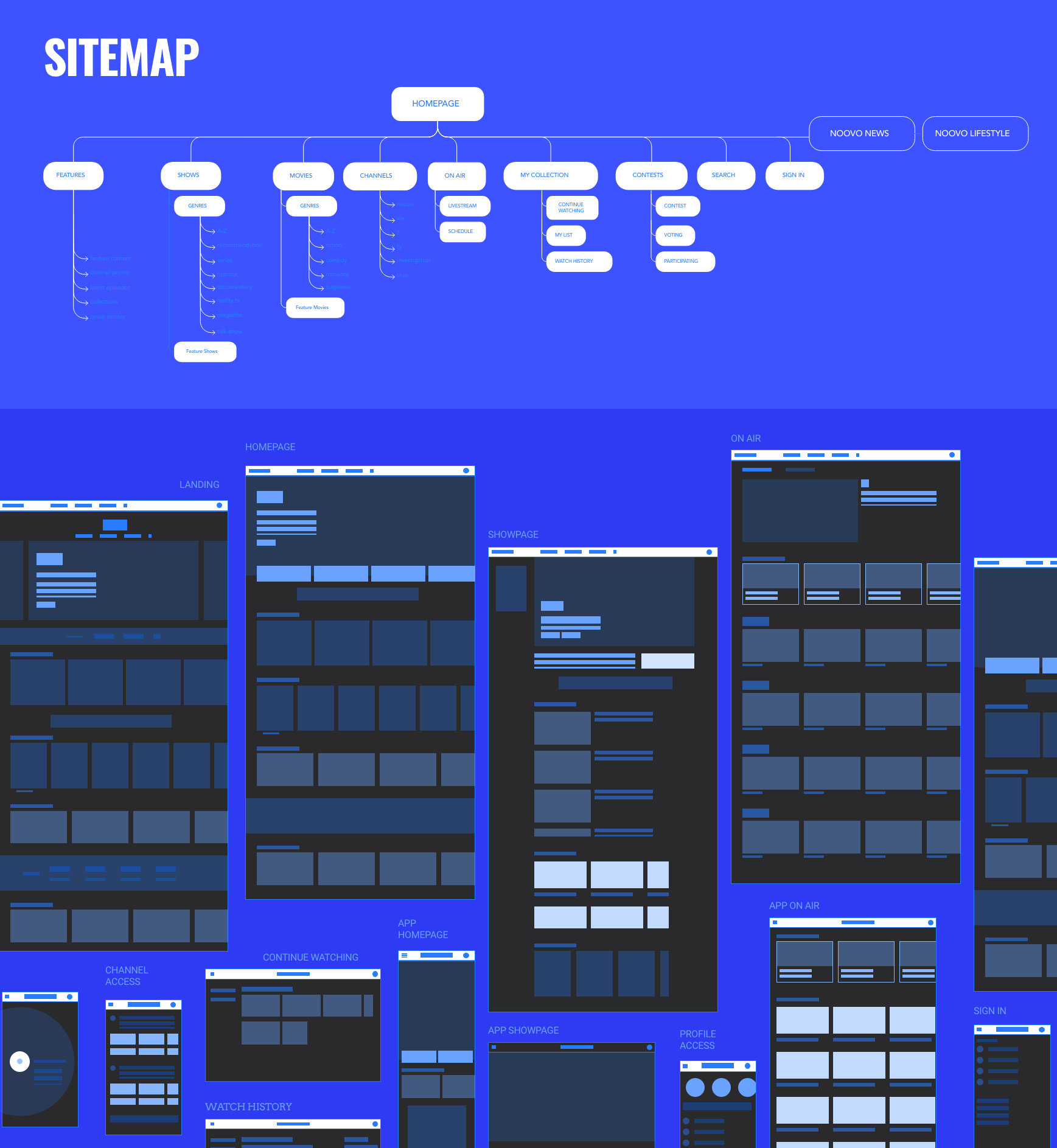

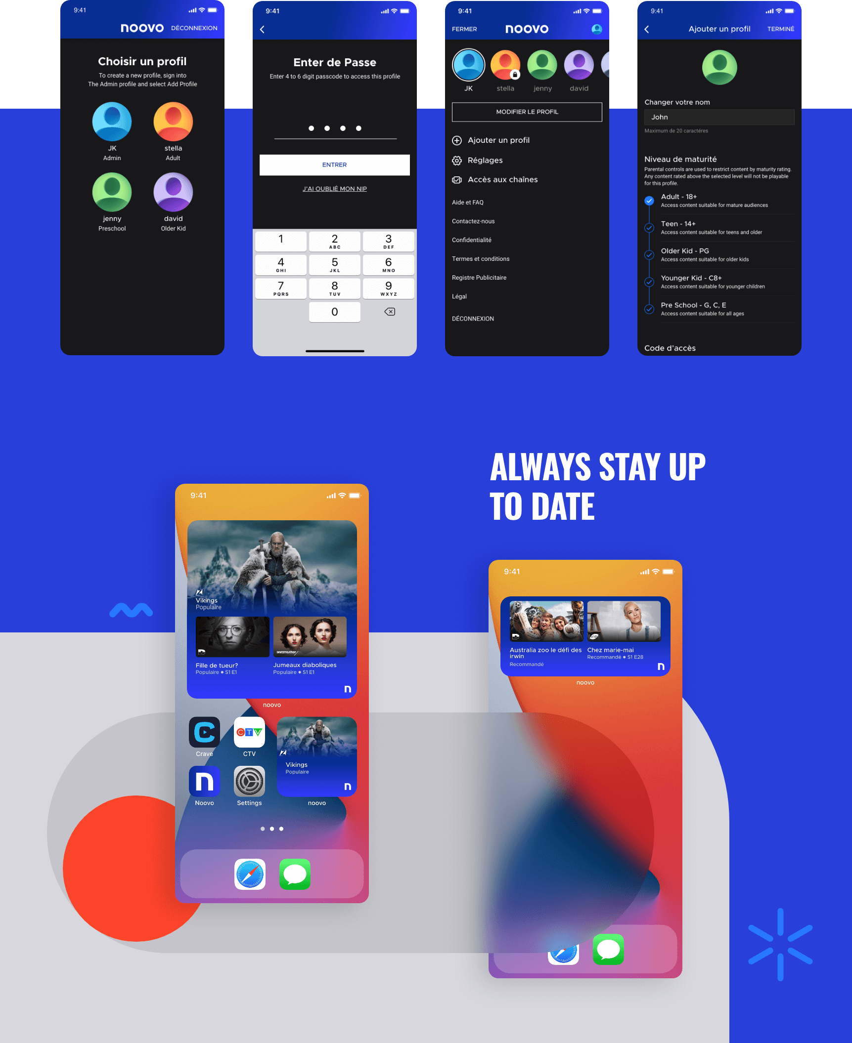
MORE WHEN YOU SIGN IN
SMART TV
APP OF THE DAY
Noovo was app of the day during it's MVP launch and received position feedback from users in both IOS and Android platforms.
10% increase in viewership between the age group of 25-54 means we also enticed a growing number of young to mature audiences; their social sharing an average of 22%.

WHAT'S NEXT?
The work is never finished. We are continuously finding new ways to engage the user in understsanding their viewing experience needs. Their invaluable feedback is now accurately recorded for future updates.